User-first lead: why this matters now
If you work in facilities design or run a busy building, the way people find their way matters more than you think — and it’s not just about looking nice. Good signage reduces frustration, cuts wayfinding time, and keeps traffic flowing. That’s why accessible elements like ada braille signs and ada room signs belong in the earliest design conversations: they serve people who rely on tactile signage and clear visual cues, and they align with the Americans with Disabilities Act of 1990, which sets the baseline for public building accessibility.
How people scan high-traffic corridors
When someone moves through a crowded hallway they use a simple visual strategy: spot salient cues, confirm with text or icon, then act. That means contrast, placement, and hierarchy beat artistry every time. A lighted blade sign that sits perpendicular to the path catches peripheral vision; high contrast and readable type let users decode the message in a glance. Industry terms to keep handy here are contrast ratio, luminance, and mounting height — those three predict whether a sign is noticed and understood under real-world stress.
Design moves that actually improve wayfinding
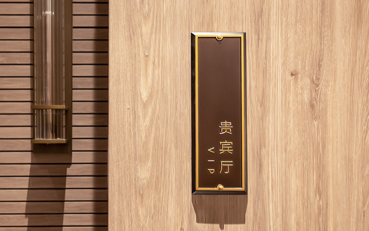
Start with where and how a blade sign is mounted: place signs at consistent intervals and at predictable heights near decision points — elevator banks, intersections, and stairwells. Use illuminated faces for low-light corridors and backlit acrylic or LED modules for even luminance. Keep typography bold and simple; pictograms help non-native readers and reduce cognitive load. Integrate tactile lettering and braille on room signs so sighted and non-sighted users both succeed. Make sure materials and mounting allow for maintenance — replaceable LED modules extend life and keep brightness consistent. Small tweaks add up quickly — a slight increase in contrast or moving a sign three feet forward can cut misdirection incidents noticeably.
Common mistakes and workable alternatives
Designers often over-brand: complex logos, gradients, or decorative type might look great in a brochure but fail under fluorescent glare. Another frequent error is inconsistent hierarchy — every sign screaming for attention leaves the reader unsure what matters. Digital screens are tempting but they can glare, distract, or fail in outages; hybrid solutions (static tactile plates with a modest digital supplement) give reliability without sacrificing adaptability. Also avoid hidden tactile elements — raised characters and braille must meet ADA guidance to be useful. — Remember: accessibility isn’t an add-on, it’s a minimum requirement and often the best design move for everyone.
Comparing options: static vs. dynamic wayfinding
Static, tactile-compliant signs excel at permanence and reliability. They’re always readable, low-maintenance, and legally compliant. Dynamic displays add flexibility for events, directional shifts, or emergency messaging, but they require power, network management, and failover plans. A practical strategy is layered signage: permanent tactile room signs plus occasional lighted blades and a small set of digital nodes for timely updates. That mix addresses both everyday flow and exceptional needs without turning your corridors into chaos.
Three golden rules for choosing the right solution
1) Prioritize legibility first: test character height, letter spacing, and luminance at typical viewing distances to ensure the sign reads in one glance. 2) Build in accessibility: tactile lettering, braille, and consistent placement should be non-negotiable for public areas. 3) Plan for durability and serviceability: choose materials and lighting systems with easy replacement parts and rated protection against dust and moisture. Use these metrics during vendor comparisons and on-site mockups to avoid surprises.
Final thought: invest in signage that respects how people actually move — it’s a practical win for users and operations. Cosun Sign. —